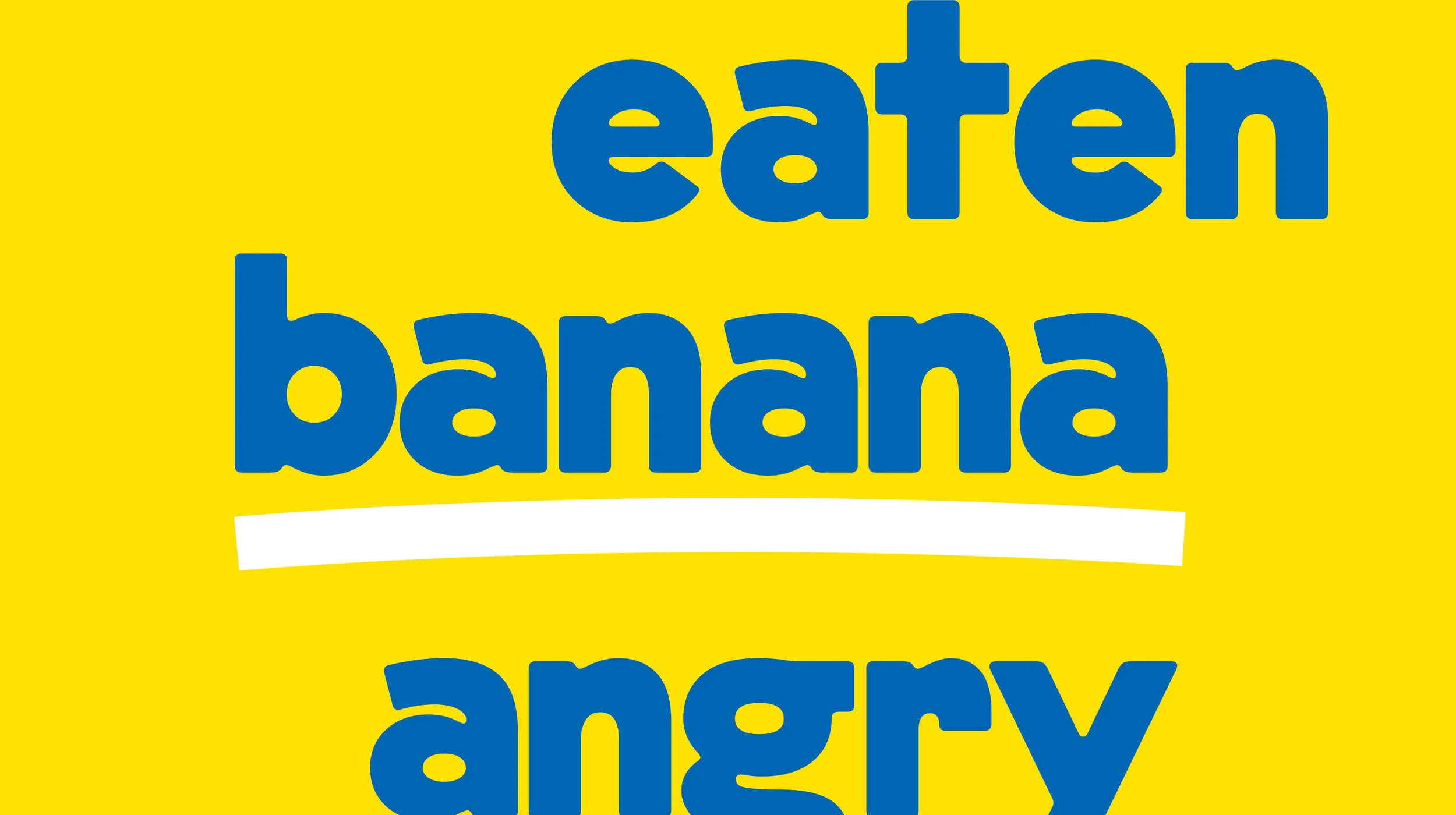
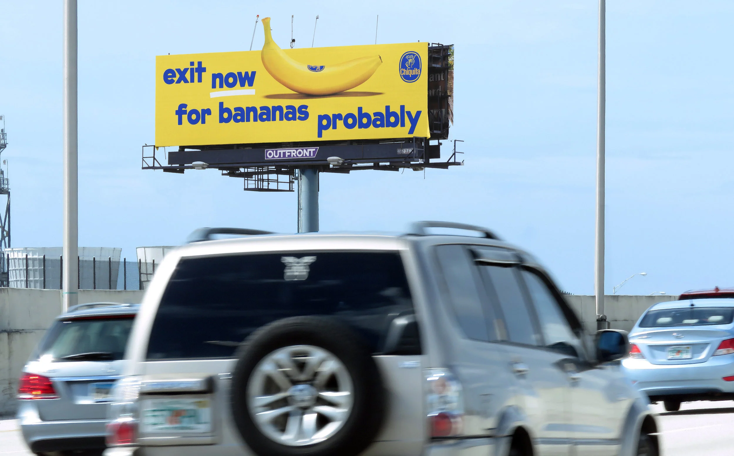
chiquita brand identity + ooh
After years of lying dormant, we re-launched a new Chiquita brand identity in the U.S. and abroad. We wanted to show people that Chiquita Bananas are playful, iconic, eye-catching, bold, optimistic, healthy, delicious and most importantly fun.
We defined a new typeface, tone of voice, photography style, and graphic elements to make every piece of communication about bananas a little bit more fun.
Creative/Design Direction: Mike Weihs, Mike Egan, Jarod Egan
Copywriting: Kate Digilio, Becca Wadlinger, Emma Dou
Designers: Julia Perry, Dee Mahon