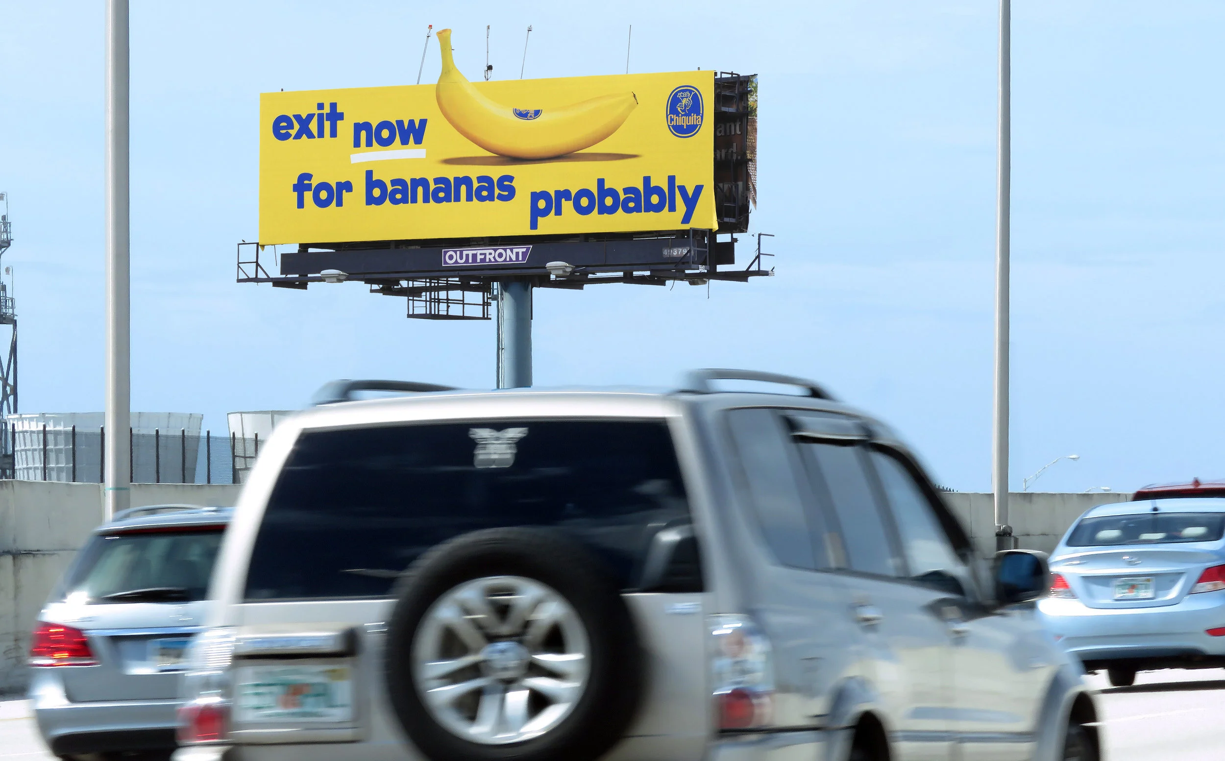
Chiquita Banana Brand Identity + OOH Campaign Launch
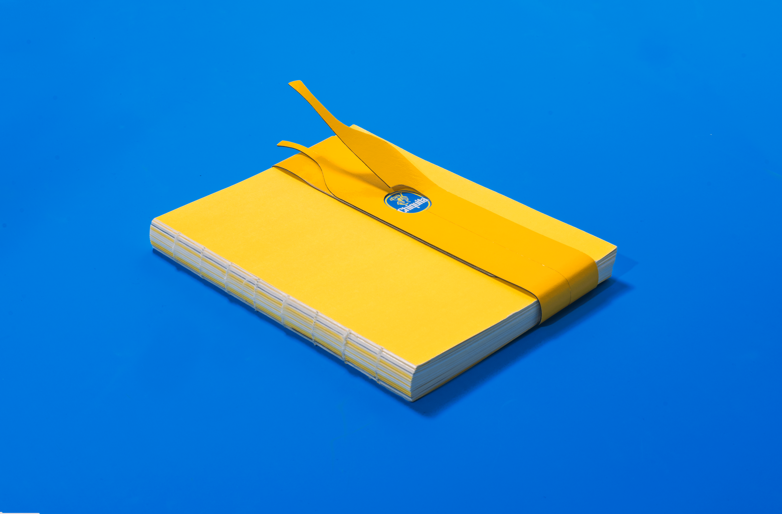
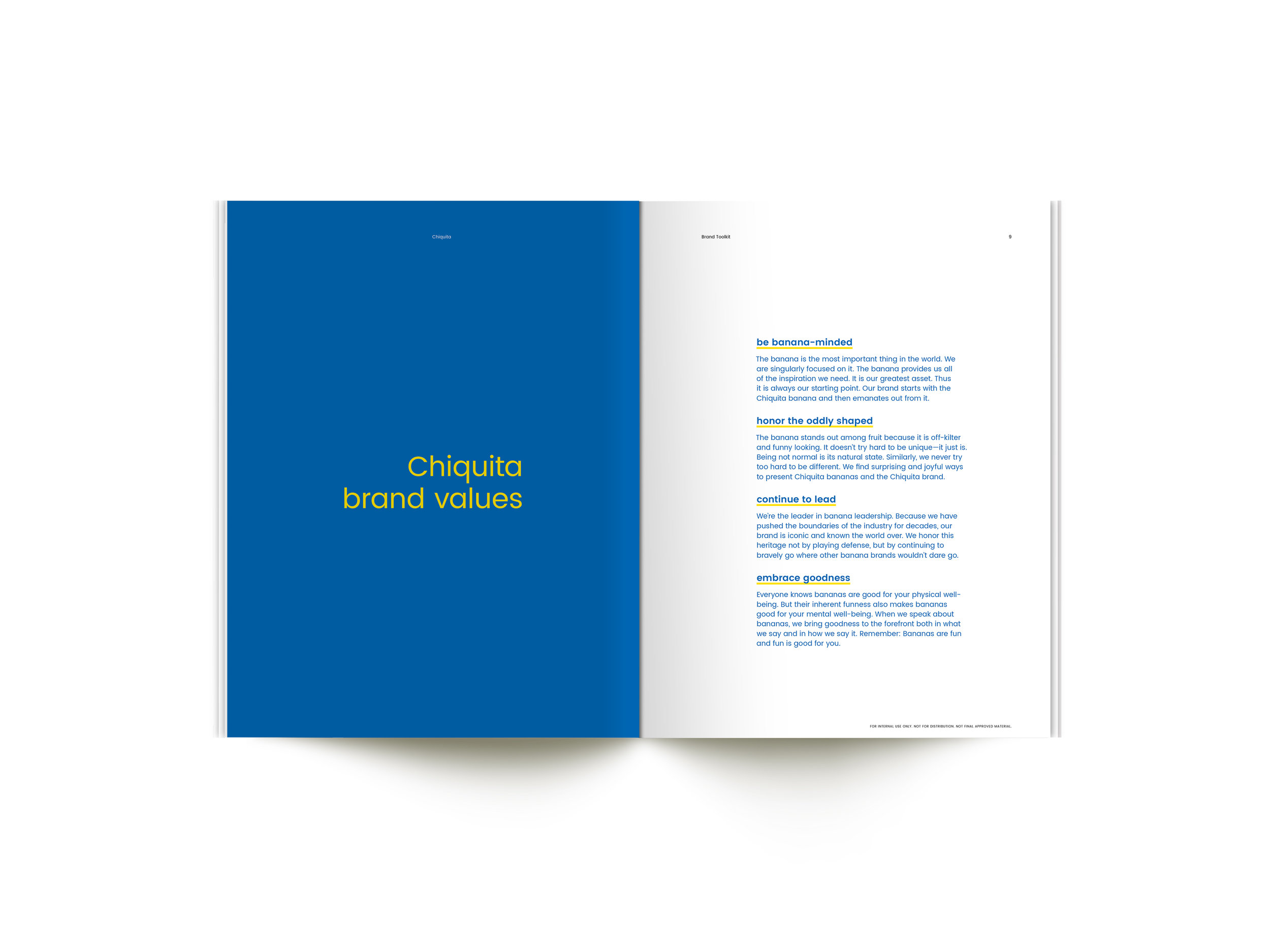
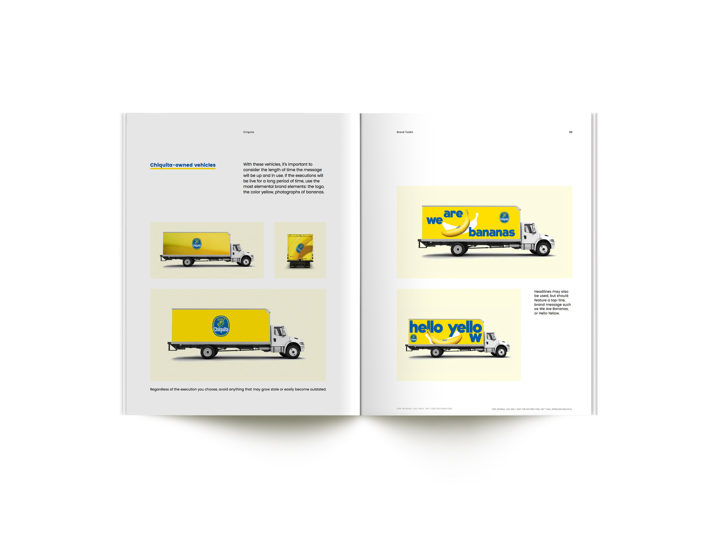
After years of lying dormant, we re-launched a new Chiquita brand identity in the U.S. and abroad. We aimed to design a playful identity, conveying that Chiquita bananas are iconic, bold, optimistic, healthy, and delicious, but most importantly fun.
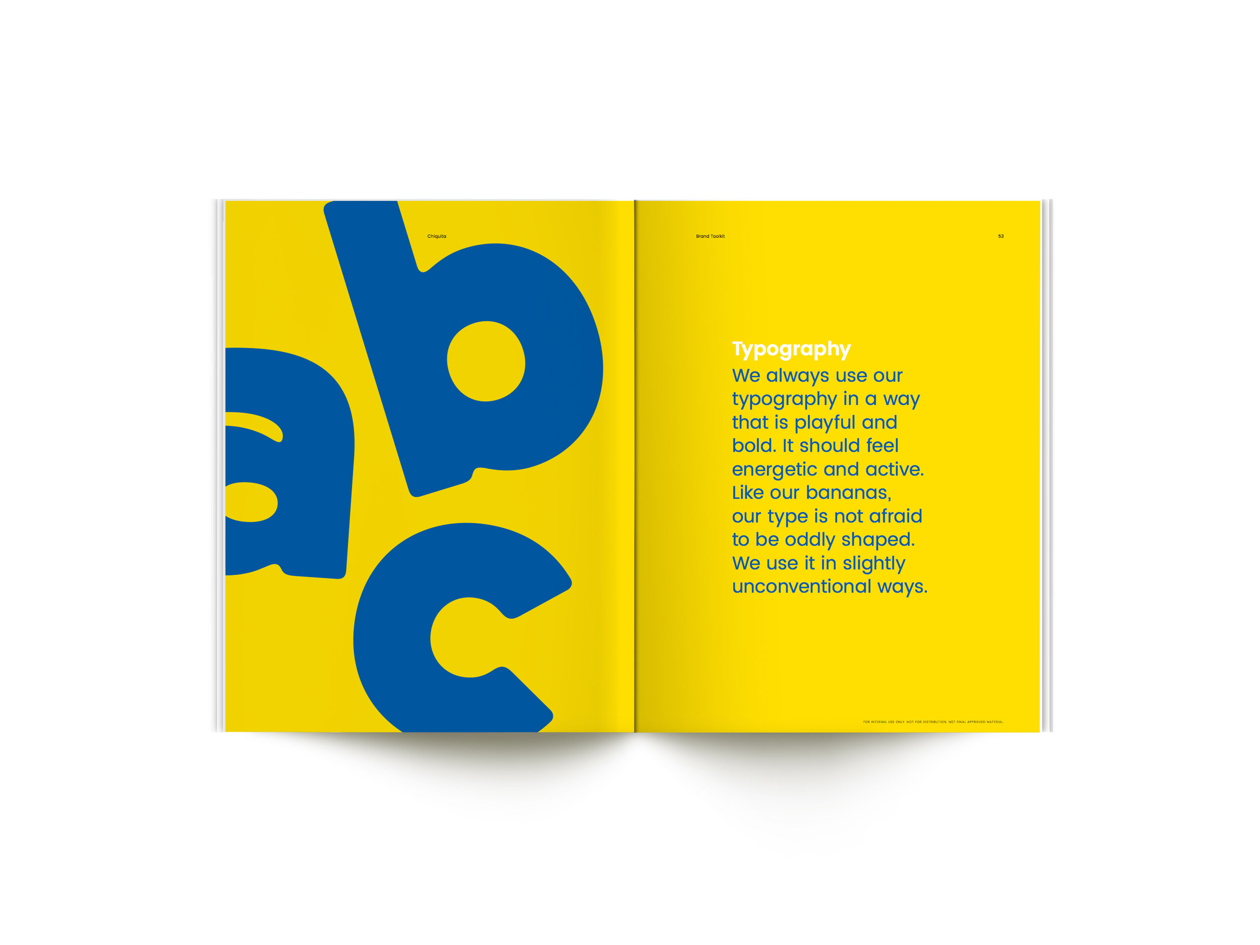
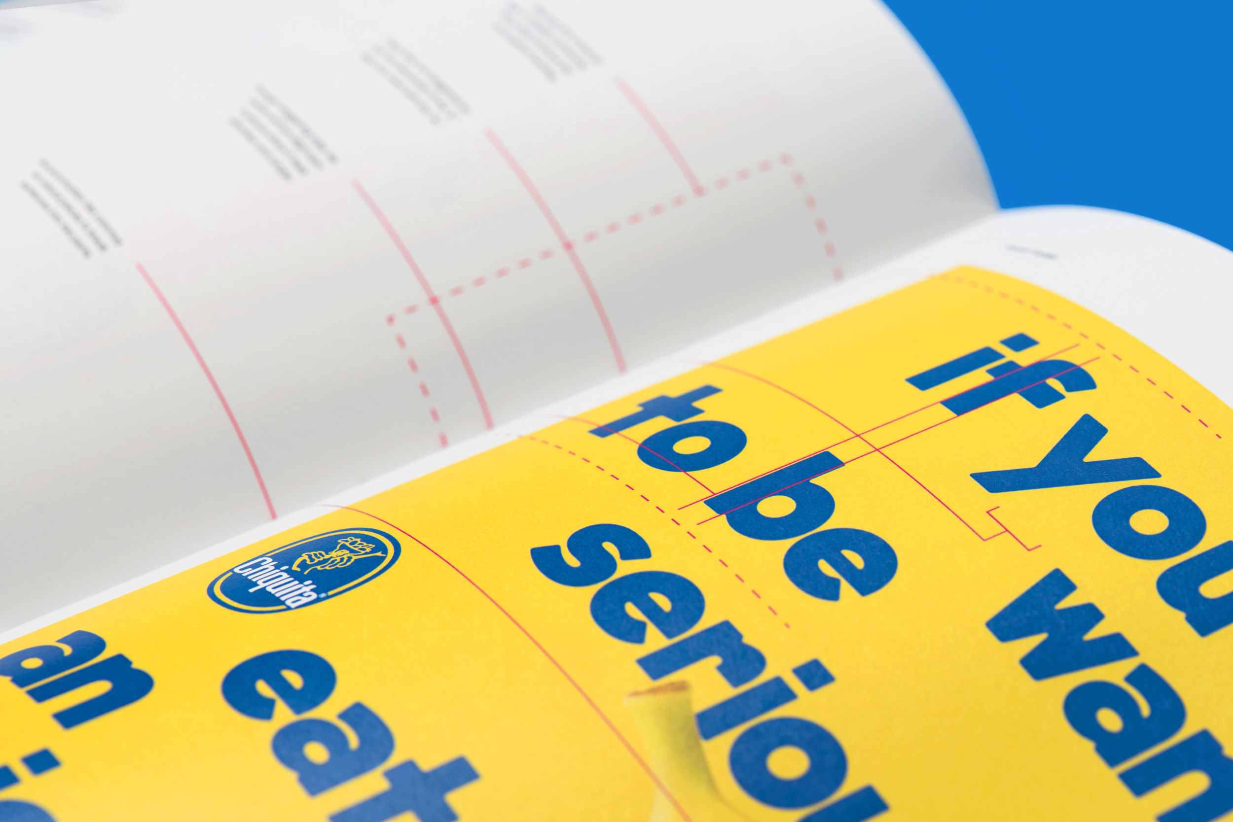
We defined the typography, tone of voice, photography style, and use of graphic elements, to make every piece of communication about bananas a little bit more playful.
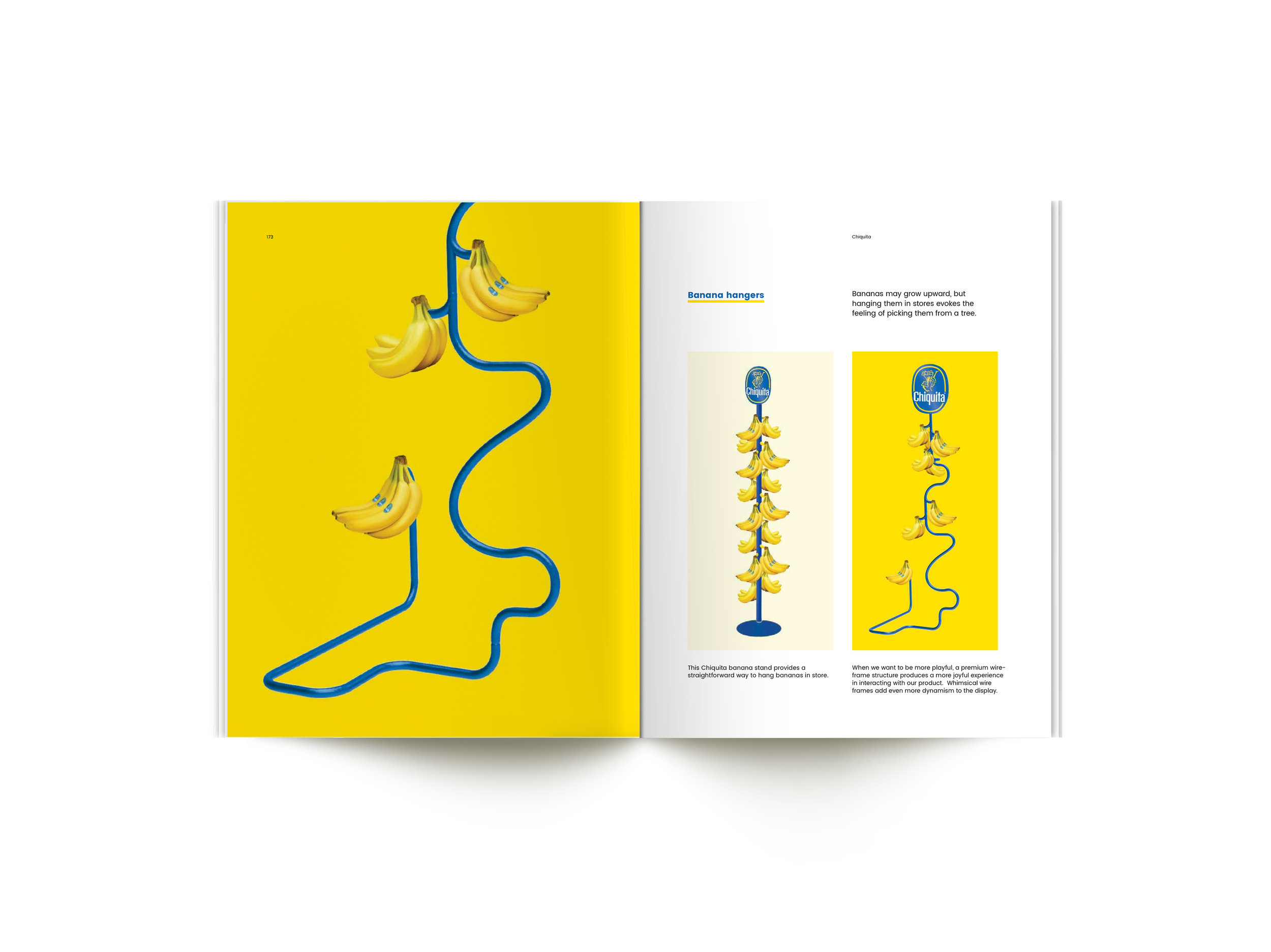
I was involved in all stages of the project, from initial concepting to campaign OOH design and production, brand book design and production, and 3D concepting for retail ideas
2017
Creative/Design Direction: Mike Weihs, Mike Egan, Jarrod Higgins
Copywriting: Kate Digilio, Becca Wadlinger, Emma Dou
Designers: Julia Perry, Sarah Hollowood, Brittany Gendron, Danielle McCoy, Lea Loo, Dee Mahon